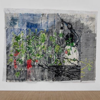
Rita Ackermann
Mama, Memory Spinner, 2019

Open: Mon-Fri 10am-5.30pm, Sat 10am-4pm
6 Albemarle Street, W1S 4BY, London, United Kingdom
Open: Mon-Fri 10am-5.30pm, Sat 10am-4pm
Visit
Mike Bouchet & Paul McCarthy: Upper Double Decker
Marlborough, London
Wed 3 Jul 2019 to Fri 2 Aug 2019
6 Albemarle Street, W1S 4BY Mike Bouchet & Paul McCarthy: Upper Double Decker
Mon-Fri 10am-5.30pm, Sat 10am-4pm
Artists: Mike Bouchet - Paul McCarthy
Marlborough presents a new exhibition from the collaborative practice of Mike Bouchet and Paul McCarthy.
Installation Views


Mike Bouchet and Paul McCarthy have known each other for 25 years, their collaborative projects catalyzed by a series of similar observations involving the Guggenheim museum. These initially started as a joke, later leading to a serious body of work presented at the Portikus Museum in Frankfurt, Marlborough in Monaco and Marlborough London.
Mike Bouchet
1970 —
Born in Castro Valley, California
The artist lives and works in Frankfurt, Germany
Paul McCarthy
1945 —
Born in Salt Lake City, Utah
The artist lives and works in Los Angeles, California
Below, a transcript of a recorded discussion between Mike and Paul, 8 June 2019 ,regarding the paintings that resulted from their “Bilboa” collaborations.
MB: Architecture and art
PM: Man, the male, fascism by association.
MB: Product through word play.
PM: All things as a product
MB: the Bilbao and the forward bow. Bilboa coming up in the wrong Google search of Bilbao.
PM: The crew will work, play, or be mistaken in some way. It was a mistake. Like I read it wrong or something.
MB: There were two mistakes. One was typing it in wrong, then the other thing was that the search engine also pulled up Bilboa images when you do type in Bilbao, so it went both ways.
PM: Who's here? Albert Speer.
MB: His son, He has the same name, Albert Speer Jr.
PM: A nod towards the colonialism of the entire museum project.
MB: Definitely with the paintings.
PM: In a way through, these particular paintings have these associations and alot of implications; The entertainment industry, and the entertainment industry connected to the architect, the architect creating old fashioned colonial imperialist architecture, even though it looks very different now, it functions the same. Its Colonial. The Guggenheim Bilbao looks like a battleship.
MB: And that its clearly an American battleship in the harbor of a European city.
PM: These paintings have this very overt recognisability, but then either the painting style, or the content, or just that they're actually paintings, somehow derails the original image in a particular way.
MB: I think what's what's interesting about the images the paintings whether they're in a group or on their own is that they remain strangely inappropriate. They don't quite fit in anywhere, but they can stand on their own. It's like when someone stands and they put their fist against their sides, and stand there like “I'm here, you know, like I exist damn it!”
PM: I think the sunscreen paintings are reminiscent of a certain history of hand painted pop: like Tom Wesselman or Mel Ramos.
MB: I can see that, but they are too specific, or even naive- they're not generalized so much, like early pop painters were doing. They are more linked to a specific consumer subculture, of a very particular Italian sunscreen and one thats very European. Theres also an interesting link there, in that perhaps the city of Bilbao, through the promotion of its Guggenheim museum, has been trying to develop the image a sort of “seaside resort” tourist destination.
PM: And even if thats not really the case, It is an art museum looks like a battleship. It succeeded in this.
MB: That there's an appropriate inappropriateness to the paintings.
PM: There's a humor in them, but there's something amazing about the painting style itself. It is clownish in some regards, and I think helps them stand on their own.
MB: The mistakes in them remind one it is a painting after all. For instance the typography or certain details dont look printed- The painters clearly weren’t painstaking in all aspects- for instance they didn't use a ruler, or the edges of objects have lost their photo quality. These mistakes make it a painting, and not a picture.
PM: The mistakes make it a painting because that tells you some sort of hand was involved.
MB: They like a more traditional luxury, like handwoven carpets, than spotless luxury.
PM: There's no lushness. They're not fetish objects.
MB: They're not seductive from a material point of view; they don't have any traditional richness or depth to them. They are also very honest- they wear their origins on their sleeve, and are not pretentious.
PM: They become unto their origins in their flatness, more than honoring their origins.
MB: This adds to the conceptual realm of the paintings in a distinct way actually. They are dry in a more “pure” conceptual sense.
PM: Some have more gestural qualities than others, but in general they are flat. Very Flat.
MB: In this sense, they exist conceptually very clearly. They look printed to some degree still, although there are alot of handmade characteristics to them. Its a particular type of flat. They are read both like a painting and as conceptual object.
PM: They are very flat, but the Implications of what they're saying though are quite layered.
MB: The implications are not flat by any means, but extremely layered.
PM: There is this complexity written into them firmly, so that they could be detached from the larger body of the project. It is symbolic of the entire project, but regardless of being detached, they refer back to the whole project and then that also becomes a layer. There's a layer to them in their associations, and meaning, in relationship to the other paintings, and those associations lead back to the original objects, and the objects leads back to the critique.
MB: They also become an extension of the thought process of how we worked, and stand alone in their representation of this process. The sense of humour is not lost for instance.
PM: I think that that that’s also acknowledging that there's an absurdity to what we're doing.
MB: Yes.
PM: Court jesters are clowns. There is a clown aspect in the paintings for sure. But I think that still is a great value in Art, and I think that the painting alone can still be….What was the word I used earlier?
MB: Indifferent? They somehow maintain an awkwardness. It’s somehow never going to fit in. Its an accomplishment to make a painting that is inappropriate, in so many different aspects. Its not an easy thing to achieve. In general, paintings can be absorbed into a given environment quite easily. It's the nature of that object.
PM: Inappropriate and yet appropriate. And the portraits. You know, one paints a portrait of the important people of the community, like giving support to the church and yet it's an unflattering style. Id say it's an inappropriate gesture and it's a joke. Its the Kings clothes without you. I have no clothes.
MB: It's important to me that even how the paintings were made is also considered inappropriate in many circles, or irreverent, or some such thing…
PM: That's part of the joke too, but it's true.
MB: The king's court now is also Worldwide. It's not just about a western power structure- I think using that word Community is actually interesting because it's its Global now, you know, it's the people play a large role in peoples heads all over the world.
PM: The paintings are portals to the complexity and layering of the entire project. And by having one, you have a portal into the entire undertaking. They exist in a visual and conceptual realm, albeit a flat painted one, but what they represent as a portal, or as a view into the rest of the project, they function as an indicator at the end of a tentacle. These paintings don’t function as a relic of this project. They are not relics, they are portals.
MB: Considering the maritime references throughout this project, that seems quite appropriate.